Something I learned after a few years of writing books, was how much style mattered in comprehension of technical material. It became the first thing my graphic designer and I worked on when starting a new project.
We would do mock-ups, fit the material into the proposed format, and try to think of exceptions that needed to fit well into the same template. “Yes, that table of contents looks great, but what about this chapter that has 25 topics?” “Let’s verify the way we want to format a menu item in the text. What if when we’re describing this process, it looks like a big wall of black text smeared together?”
When deciding where to begin, we first scoured books and websites to see who was doing it right and who was, umm…. needing to improve their presentation of information. 🙂
- Look for concise explanations of why the page is relevant, so people can quickly determine whether or not that page will help them.
- Break large sections up with subheadings, so it’s easy to jump ahead or remember where to resume.
- Use changes in color, font-family, font-weight, font-style, all caps, and/or font-size to delineate sub-sections to view from action items and plain text.
- Be sure the entire process is laid out on one page whenever possible. Links or page references are ok at the very beginning and end (like pre-requisites and supplemental information), but do not make them leave the page midway through your steps to do other steps before they can continue.
- Use unordered lists to highlight important information. Use numbered lists for steps that cannot be done in a different order. Having content separated into lists allows customers to relay to technical support where exactly they are stuck, “I am on step 3 on page 195 of this book.”
- Images aid in comprehension, but too many can interrupt the learning process. Skip images for simple steps like “Click File > New,” but do include images for complex interfaces that have text inputs, radio buttons, dropdown menus, and other form fields. If there are a lot of steps, consider an “After” image so students can compare settings before they jump to the next section.
- Once you think you have your template finalized, see if it passes the “Squint Test.” If you stare at it and blur your eyes, is there enough whitespace? Do the headings and sections stand out enough? Are you able to see the sub-sections to view and action items jump out from the text behind? Could you follow them without the rest of the text on the page? Do you have enough images or too many? Are there any formatting or flow issues?
What does this all mean? Let me show you with some examples.
Here’s a random page from Apple’s support site:
I like the following:
- Device mentioned in the page title
- Where the error message might appear
- What the error message is
- Picture of the error message, so people skimming the page can see it and immediately know it matches what they see
- Clear headings for symptoms, resolution, and additional information
- Link color very different from the text color
If I could change the page, I would:
- Change each of the unordered bullet points to be a separate resolution in themselves with directions on how to do each
- Add options to contact support or give feedback on the page

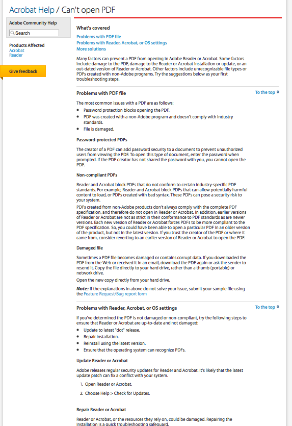
Here’s a page from Adobe’s support site.
What I like:
- Clear headings
- Decent intro so visitors can decide if the page is for them
- Products Affected section on the left
- To the top links for a very long page
If I could change the page, I would:
- Are there different error messages you receive when you cannot open a PDF? Should they be listed here with links to their own resolutions?
- Remove filler sentences like “Try the suggestions below as your first troubleshooting steps.”
- Highlight the correlation between the first three bullet points and the headings below Problems with PDF file (should that be an A.B.C. section? should it be links?)
- Make the difference between headings more distinct “Problems with PDF file” and “Password-protected PDFs” don’t pass the squint test.
- Italicize action items like “To open this type of document, enter the password when prompted.” to separate it from the rest of the paragraph.
- Shorten the text-smear for Non-compliant PDFs (switch to a bulleted list of what makes something non-compliant, and add links or action items if possible).
- Don’t strand the customers with suggestion to “repair the installation” in a bullet point that isn’t linked or suggested that it’s related to the content that follows. Would accordion menus help or just be an annoyance?
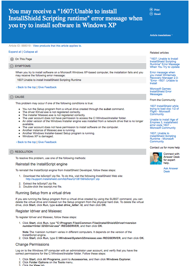
Here is a page from Microsoft’s support.
What I like:
- They are experimenting with headings as accordion menus
- Print, email, and translations links all at the top
- Articles have ID numbers for easy reference (Think about a customer calling you and saying “I’m looking at article ID 888019” versus “I’m on http://www. yourwebsite dot com slash this folder, next folder, next folder, this page name, dot file extension.”)
- Link to support in the sidebar
What I would change if I could:
- This page is very busy. The squint test reveals the Customer Support agent’s photo and anything in blue is most important on the page. Perhaps pictures in the article (instead of in the sidebar) and less blue would help reduce customer support inquiries and increase comprehension and retention of information.
- Color makes things stand out. Lessen the importance of links like “Back to the top | Give Feedback” and Related articles and From the Community, so the Symptoms, Cause, and Resolution have a chance to be seen.
- The headings under Resolution don’t work. They smear into the body of the next steps. Combined with the bolded items in the steps, it makes it look more difficult to follow. Don’t scare them off with the way you present the information. I would experiment with the font-weight, font-family, and color to make the separation more clear.
- Blockquote, in a blockquote, in a blockquote, in a blockquote. If you look under Resolution, each section is indented from the next thus reducing the amount of room to write in.
- Needs more
pepperitalics. Not everything can be bold. - When a visitor needs to type in something, put that information on a new line by itself so it can be easily copied and pasted.
- It’s important to tell people where to click, but step 1 under Change Permissions is getting in its own way. Would you rather see and follow:
“Click Start, click All Programs, point to Accessories, and then click Windows Explorer.”
or
“Go to Start > All Programs > Accessories > Windows Explorer.”
Here is a page from T-Mobile’s site:
What I like:
- Article revision dates
- Distinct headings
- Links to other articles on important words. It’s good to see “How to enable POP3 access…” as blue and not the word “See” linked as blue.
- Resolution steps are numbered
What I would change if I could:
- Reduce the number of bullet points. There’s a balance and this page is going too far in the organized-page direction. Change “what happens and why” and “probing questions” to paragraphs to see if the page can be read more easily.
- Remove redundancy (heading “What happens and why” followed by “Possible causes include the following:”)
- Remove the author names from the client-facing side. It’s ok for technical support to see this while editing, but the customers don’t need to know tmo_brian created it or tmo_josh edited it.
- Pictures?
- Step 2 at the bottom says “in the email account settings” but does not state how to get there. If this is a page that is supposed to encompass many different devices at the same time, a caveat at the beginning should be included saying so. Whenever “see the user manual” is referenced, that would be a great time to link to a table of contents of all the user manuals uploaded to the support server. Relying on the customer to have a piece of paper they probably stored or threw away, then not linking to where they can find the information online will cause customer frustration.

I hope these tips and style breakdowns help you appreciate good technical support design when you see it. As you can see, not enough hurts comprehension and too much makes directions difficult to follow or appear intimidating.
Find your own balance. Use support staff, customer feedback, and beta tester groups to help you find that balance.
